I have a couple of clients who primarily know me as a “coder”. I’m the guy who keeps their website running and codes new functionality for their existing infrastructure. As far as my graphic design skills go, they haven’t had much interaction with me. So, it’s fun when one of those clients passes me a project that lets me showcase my skills. Such was the case with the ThriftTrac.com website I built this past week.
Long time client and friend, Steve Slack, came to me needing a marketing website built in time for his AGRM convention appearance. The website would promote his company’s software, ThriftTrac. ThriftTrac is a web application that thrift stores use to track donations, partners, volunteers, and more. The data it provides helps thrift store businesses make decisions that make them more profitable and efficient.
Brainstorming the Initial Concept
We got the project kicked off by having me talk with ThriftTrac’s marketing manager, Evan Crass. During our phone conversation, Evan gave me an overview of the software and helped me understand the problems it solves.
ThriftTrac takes the oft neglected data from thrift store businesses and turns it into actionable reports for thrift store managers. This understanding led me to the metaphor of ThriftTrac turning a messy desk into an organized desk. I came up with the following flow for the website:
- Messy desk with donation receipts
- Organized desk with ThriftTrac on a computer screen
- “Act on your data” – an overview of ThriftTrac’s features
Site Development and “We need a logo”
I selected the Altitude Pro theme as the starting point for my design. It features a clean, one-page scrolling layout that works great for introducing products and services.
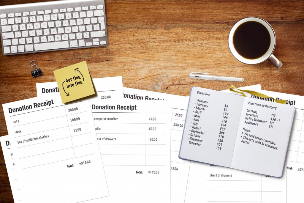
The first section of Altitude Pro’s home page features a background image with text overlaid. This is where I would show a messy desk and reveal ThriftTrac as the solution. The following is the messy desk graphic that I created for this section:
The donation receipts and Post-It note are items I created in Photoshop. The desktop texture is one I found via a free stock photo site. The other items are from a Creative Market Photoshop file called Custom Scene – Designer Ed. – Vol. 2.
Once I had my scene setup, I started working with it in Altitude Pro. It quickly became apparent that I needed a ThriftTrac logo and color palette to push my design further:
Steve had mentioned he was going to have someone attempt a logo design for him. When I checked, he said he wasn’t happy with the attempts so far. He shared them with me, and I wasn’t pleased either:

I needed a proper logo to continue with my design. Neither of these fit the bill.
So, I offered to do the design, and here’s what I came up with:

Steve and the rest of the crew loved it, so I continued building the site. In addition to working on the layout and visuals, I also wrote the site’s copy by gleaning ideas from their marketing materials.
Site Launch
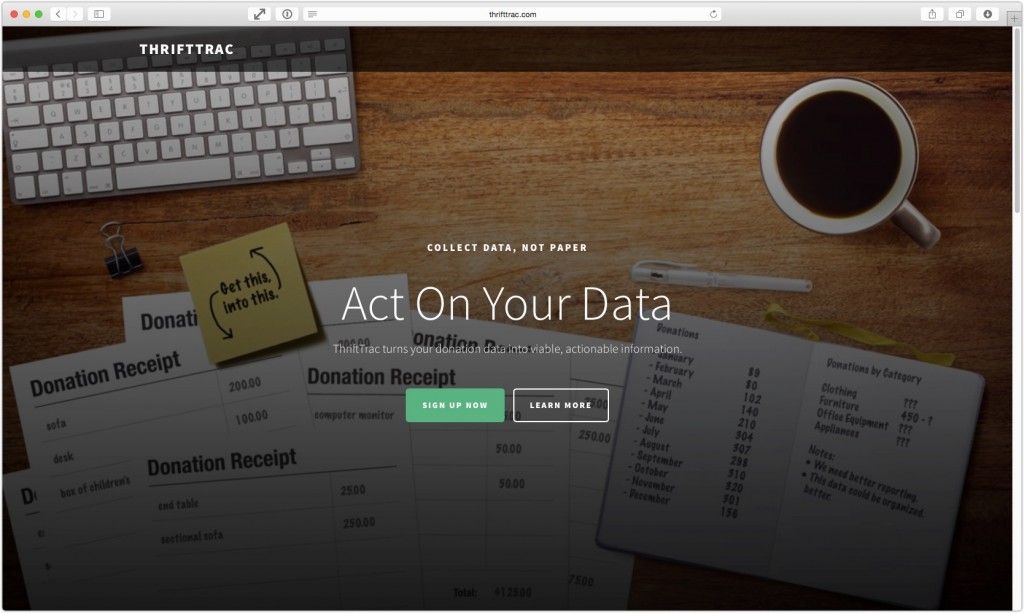
I had started developing the site on Wednesday, May 21. We launched the site on Tuesday, May 26. You can see it live at thrifttrac.com or by viewing the screenshot below:


Leave a Reply