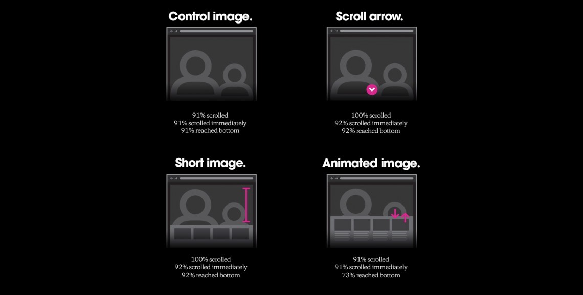
UX designers are divided about how essential above-the-fold placement – that is, positioning so that users can see content without scrolling down – really is. Chartbeat found that “66% of attention on a normal media page is spent below the fold.” In contrast, the Nielsen Norman Group showed that “users spend 80% of their time looking above the fold.” We wanted to know how page design impacts these user behaviors and to what extent visual cues help users scroll below the fold. ~ Everybody Scrolls


Leave a Reply